Radial Design System
Create a modern, scalable, user-centered design system that will allow its users to design and iterate quickly using styles, effects, and components that are inline with development's single source of truth.
Let's try this
Version 1.0
At CDK Global, we needed an updated, responsive, and dynamic design system. One that could grow and scale to support all of our designers, users, and ultimately, our customers. The previous version of the design system, Radial, was built in Sketch. At the time, Sketch’s offerings were not fully evolved to allow for simplified dynamic properties. We had an obscene amount of variations and nested components. Managing the component library was getting more difficult and we were getting ready to create additional themes within the design system. We started to struggle, to say the least.
Roles
Lead Designer: Design SystemsVisual Designer
Deliverables
Low-fidelity wireframesHigh-fidelity mockups and prototypes
Design system
Design and Markup for new public-facing website
Tools
SketchFigma
Miro
Invision
HTML/CSS/SASS
JSON/JavaScript/jQuery
Overview
My first project after joining the Radial Design System (RDS) team was to lead the redesign of the entire design system. The company had hired an outside firm to help kickstart the project with design and development. I worked directly with the designer they assigned. Together, we sketched, presented iterations in design reviews, tested components with other designers, and built component specifications for the developer team. Our tools were Sketch and Invision. Our work would be used to build the React.js foundation and component libraries. Dozens of applications would be built using our library of styles, components, and patterns. Our work would serve about 15,000 auto, heavy truck, agriculture, construction, power-sports, marine, and RV dealerships throughout North America.
To comply with my non-disclosure agreement, I have omitted sensitive information. All information in this case study is my own and does not necessarily reflect the views of CDK Global.Problems and Solutions
We needed to create a design system that developers could build fast. Management wanted development teams to start building their apps with this new design system. We built over 1,000 components in Sketch and created many new patterns for our designers to use when building layouts with RDS. The handoff happened in Invision. We needed a place to store our component specifications, where developers could easily review them and access properties with little effort. Invision’s Inspect Mode proved to be the answer, until it wasn’t. Developers complained it was too cumbersome and difficult to get the information they needed.
The Results
We delivered a solid and complete design system in 4 months. The development team was able to build the design system in React.js in record time and our stakeholders (project managers and our CTO) were very pleased with the result. We would have to rebuild everything in Figma a week after our official release.
Let's try this again
Version 2.0
I happened to mention Figma to our VP of Design. I had been using Figma on my own for a while already, so I was tasked with testing the app and its features against our wants and needs for a more robust design tool. Immediately, the built-in Auto-layout feature was a game-changer. Three years after convincing management to switch to Sketch from Photoshop, I played a key role in convincing them again to switch to Figma. We swiftly built the libraries, along with a UI Kit, tutorials, and detailed documentation. Within three months, we migrated the entire UX team to Figma.
Designed for the Designer and more
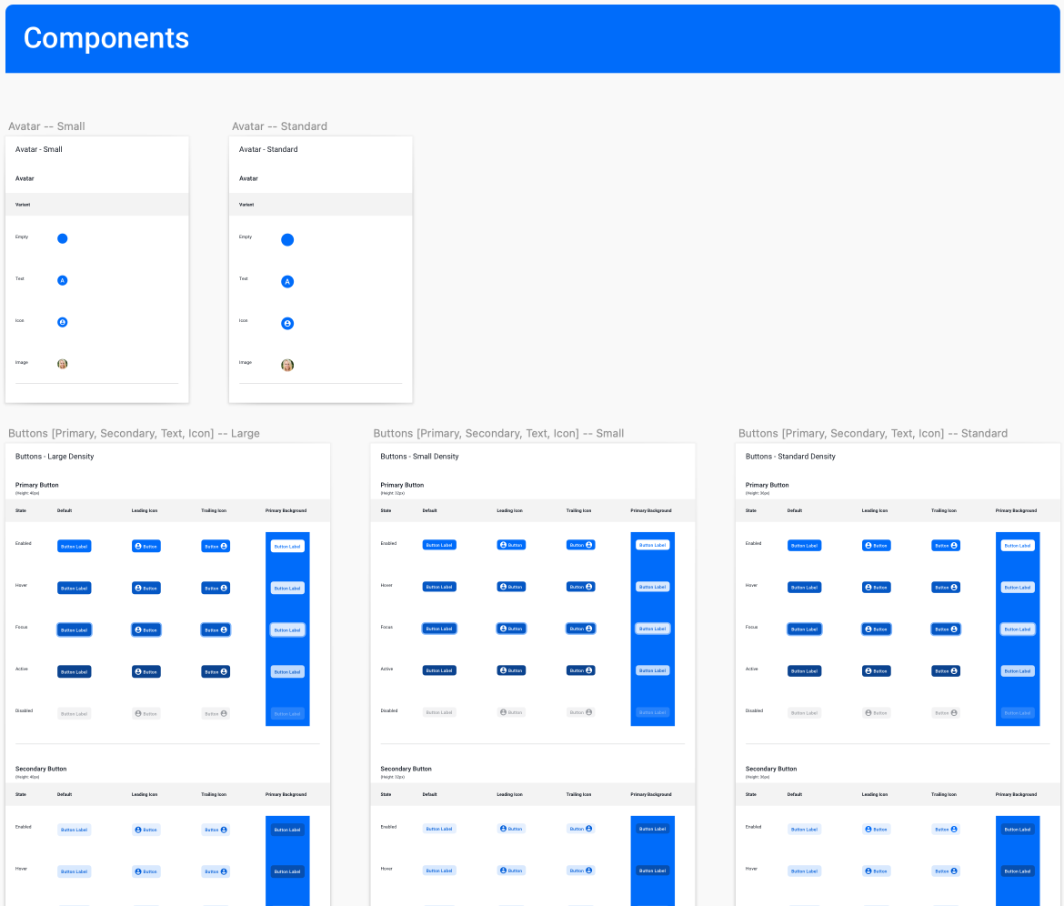
We set out to deliver a set of standardized guidelines and design assets that would be used to create consistent user experiences across all of CDK products. This time we had an entire team to build it. I led a design system team driven by a UX architect, a UX creative strategist, and a junior UX designer. We built a robust UI kit, video tutorials, and detailed component documentation. Entire sprints were spent researching and testing components for accessability and usability. Incorporating feedback and ideas from our designers into the design system helped ensure that it met the needs and expectations of our users. Through our efforts, we delivered a design system that was responsive, WCAG AA compliant and provided a consistent and intuitive user experience for the user, and ultimately, the customer.
A Single Source of Truth
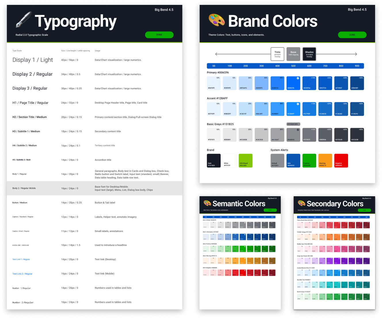
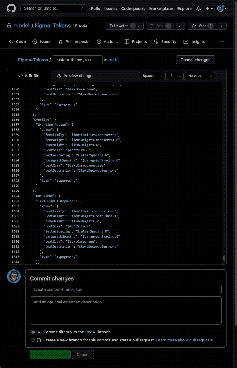
We worked diligently to build the components in Figma so the dev team could start immediately updating the component library. With a refreshed theme in hand, I created JSON files for the dev team, so they could quickly build and compile the SCSS files to CSS-in-JS for their React Styled Components library.
JSON to Design Tokens
Now that I had all the typography, color, and effects styles in one big JSON file, I decided to try my hand at creating design tokens. Using the most excellent plugin, "Tokens Studio for Figma" from Jan Six
 and his team, I was able to import my properly configured JSON file into the plugin. Styles and colors were automagically populated into the Radial Design System I had previously defined.
Although we never ended up using the tokens the way they should be, we did manage to use them in the "description" field for each style, color, effect, and component. This, ultimately helped the dev team when in "Inspect" mode, by displaying the exact design tokens used in their JSON and SCSS files. A big win for retaining a "single source of truth" and making the design handoff much easier and much more valuable.
Design, Dev, and a Storybook
We went a step further with the Design System in that we tested embedding documentation we built in Figma directly into Storybook. This worked great for a while, until we discovered that the user can scroll the entire Figma document...things the developers do not care about nor need to see. We quickly removed the embedded docs from Storybook.
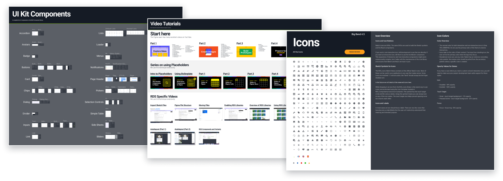
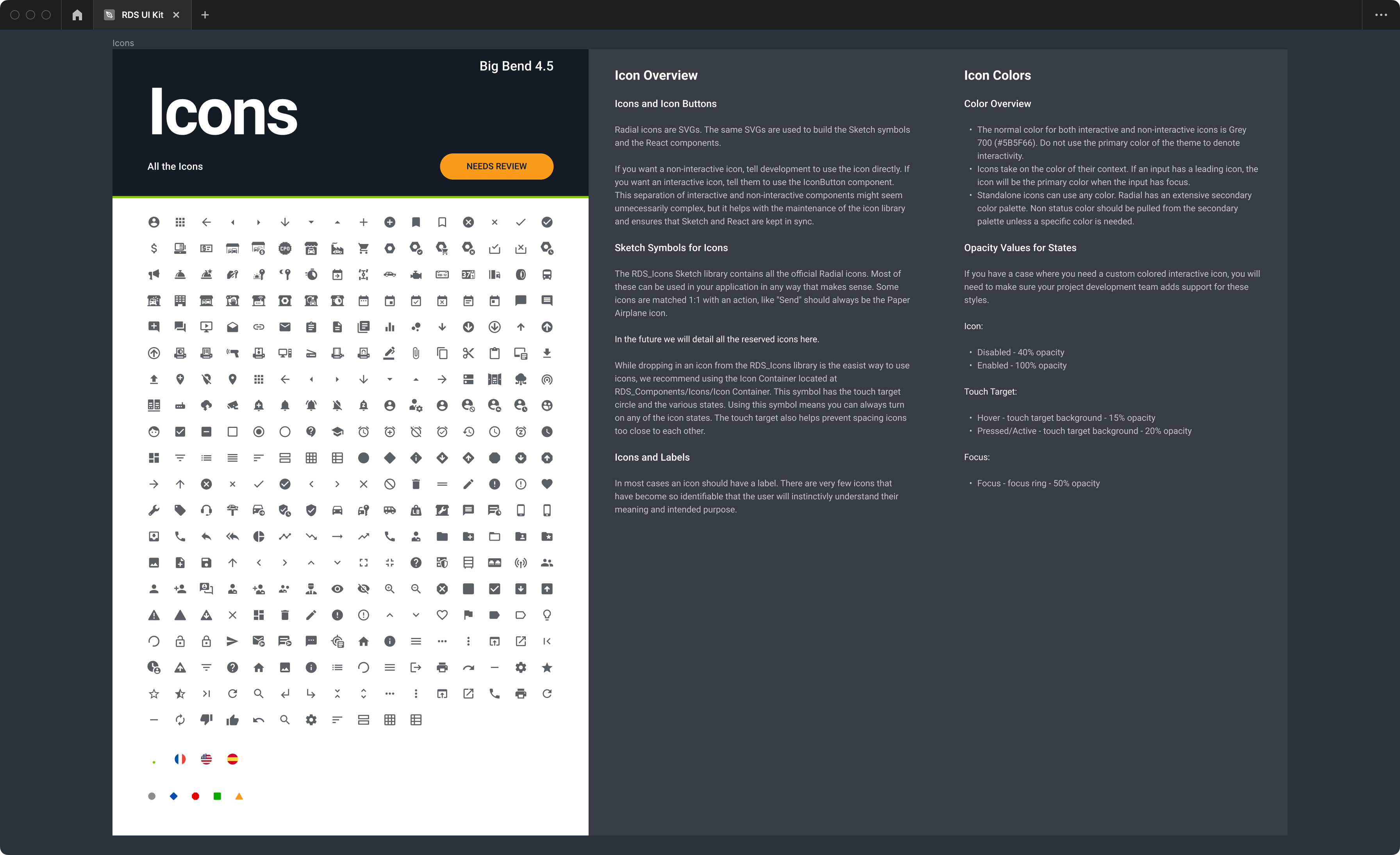
The component documentation was built to scale. Plugins were used to use multiple columns of text that are linked to a Markdown file. Documentation can be switched from Light Mode to Dark Mode when necessary, and the entire page is a highly customizeable Figma component. Each library component is accompanied by its documentation. This allowed designers to choose the right component for their needs based on the documentation. This was proven to save our UX team a lot of time and questions about the library styles and components.
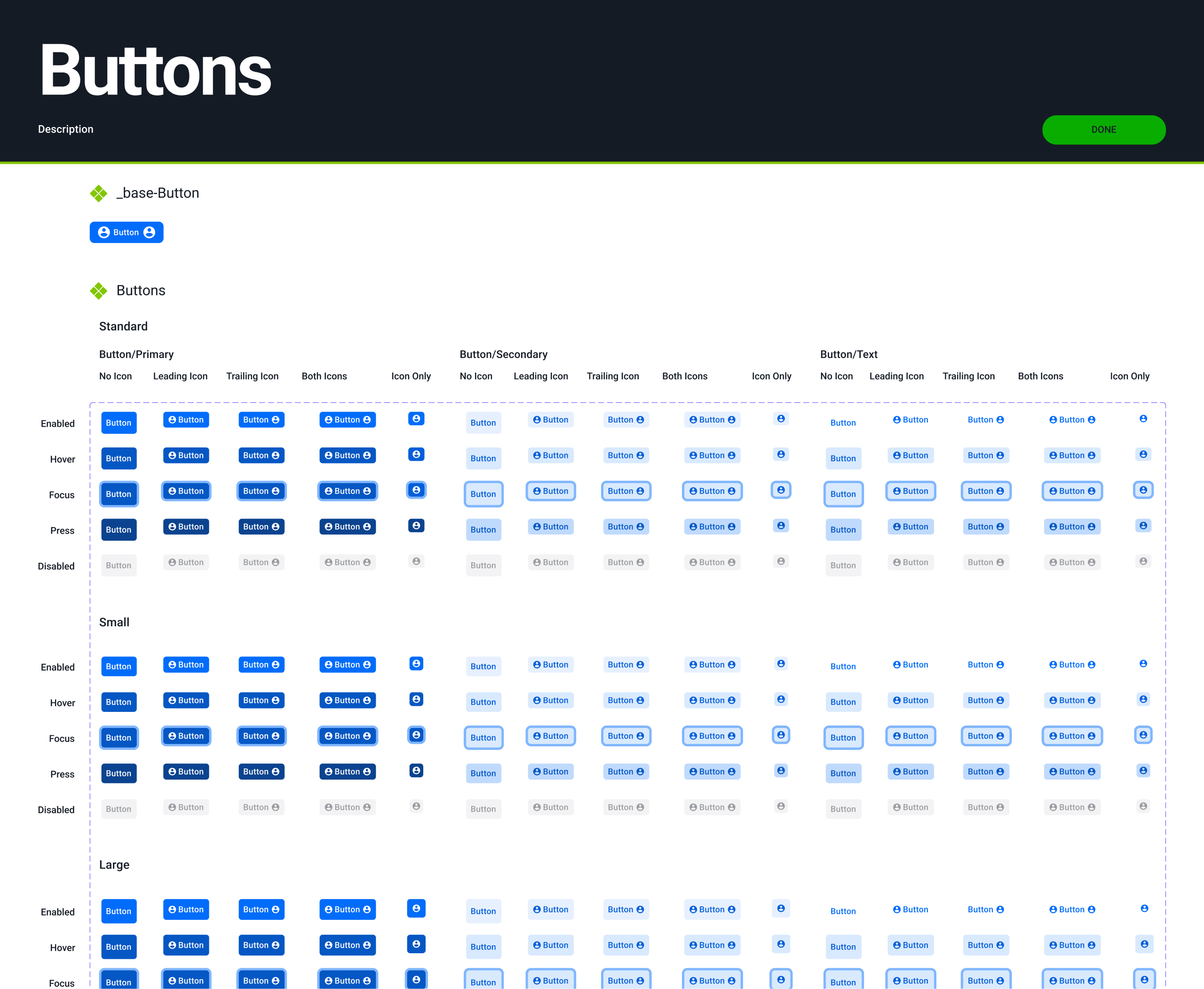
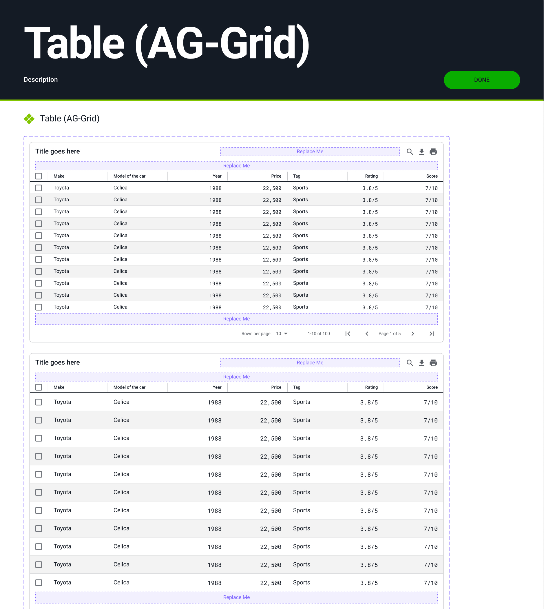
Customizable Components
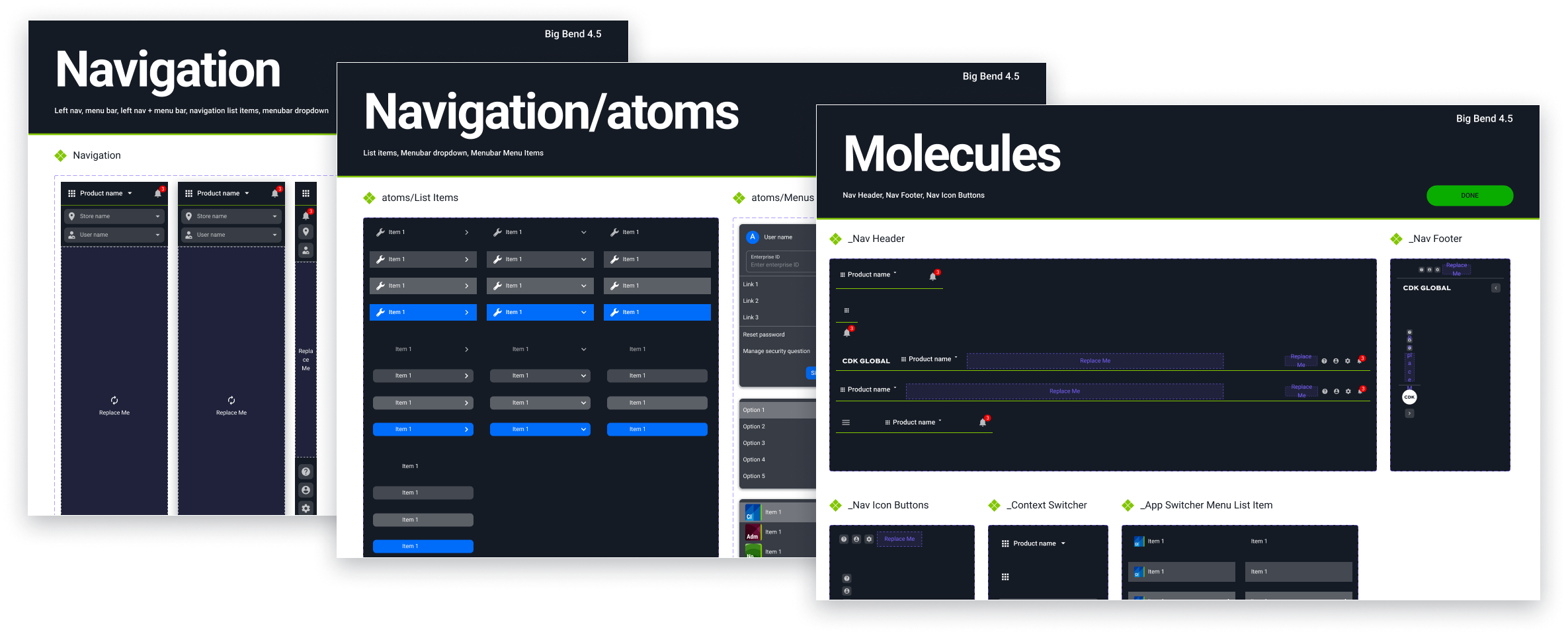
Using the "Atomic Design" principles, we gave designers the ability to change the fonts, colors, shapes, and content of these highly customizable components. We quickly published the Foundation library, so we would have access to the style library and the color system.
We built the components with the ability to change the attributes of any atom in the component. Ultimately, we were able to reduce the number of variants by one-third, simply by adding "component properties" to the variants in Figma.

Atomic Design...or what we called, "Legos®"
The idea behind "Legos®" had been floating around for a while already. Someone had mentioned it during one of our weekly design reviews. It made the most sense for this design system to build the libraries around those atomic principles. We looked carefully at every component and decided on the best way to build that component. Some were just simple, responsive components. Many others were nested components built using highly robust, "atomic" Legos®.
Direct Impact
The Results
We had an excellent team of UX Researchers that provided us with great data. Extensive user testing using our own UX designers gave the design team a ton of insight into the mass of quantitative and qualitative data. We had iterated on successful designs and patterns, and tested frequently. It didn't take long until the entire company's UX team was using Figma and RDS. They were building complete products in short time. As with any design system, RDS received a minor UI facelift. But, with the green-light given to a skunkworks project the team was working on, RDS was going to need a complete overhaul and tune-up.
