Catalyst: A Modern UI
"We need a super modern UI that mimics the luxury vehicle websites, but not black and white. Oh, and it should have very little color, if any." 😳
You have the entire Sprint
Version 0.1
With the acquisition of "Roadster®" in 2021, the CDK Execs decided it was time for another refresh/overhaul/tune-up of the entire design system. Looking for a more modern look, we were tasked with presenting a totally new and modern UI by the end of the Sprint (10 days). This window quickly closed to 3 days. We each took some time to sketch, create mockups, whatever it took to come up with some great ideas to present, quickly.
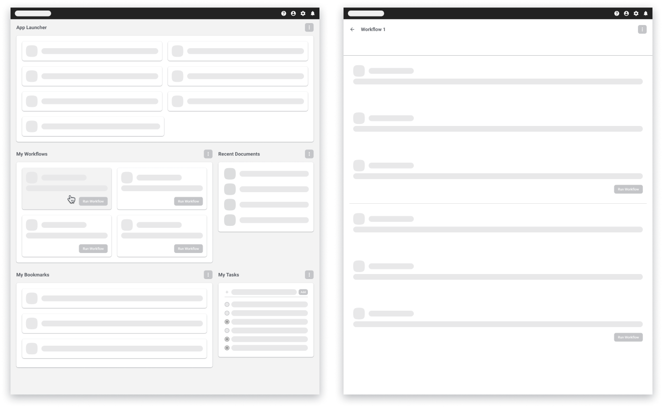
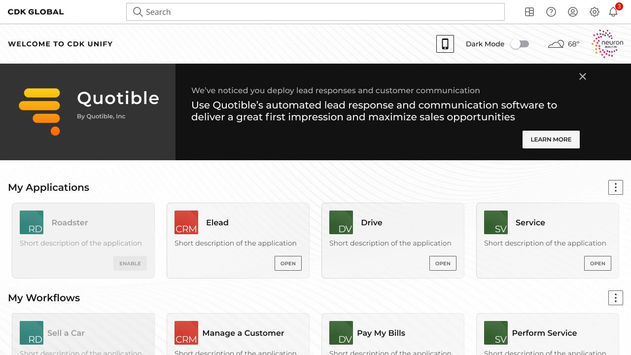
We voted on the work created, then built a quick flow example for what this was we were trying to present. The premise developed into an entire platform backplane that was to be the all-encompassing "home page" that would allow the user to access assigned applications, custom workflows, and daily tasks.
Roles
Lead UX DesignerDesign Systems
Visual Designer
Deliverables
Low-fidelity wireframesHigh-fidelity mockups and prototypes
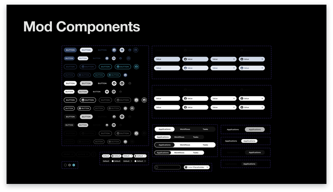
New design system
New platform concept
Tools
FigmaMiro
HTML/CSS/SASS
Backplane POC built with React.js (Dev front-end)
Overview
The design system team was given the task of creating a "proof of concept" feature that would centralize the user's applications, workflows, and tasks. In addition, this concept should demonstrate a new, responsive, and modern UI, reminiscent of luxury vehicle websites.
To comply with my non-disclosure agreement, I have omitted sensitive information. All information in this case study is my own and does not necessarily reflect the views of CDK Global.Problems and Solution
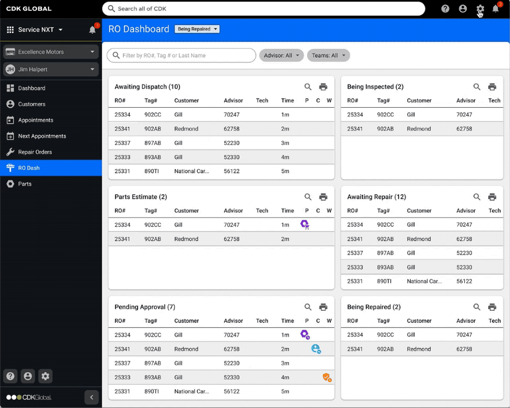
The CDK web applications that car dealerships would use throughout the day did not provide a common space where users could keep a list or shortcuts to the applications assigned to them, or even create workflows. Our concept flipped the paradigm in terms of how the applications functioned with eachother and even how they were built. The concept allowed for current APIs and even future acquisitions to be plugged in to the backplane which maintained the users custom settings. At any point, the user could access their assigned collection of applications, and their personal workflows and tasks, saving time and money, and making the user's day that much more enjoyable.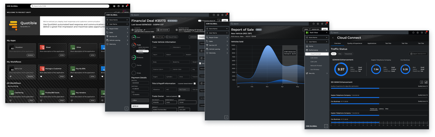
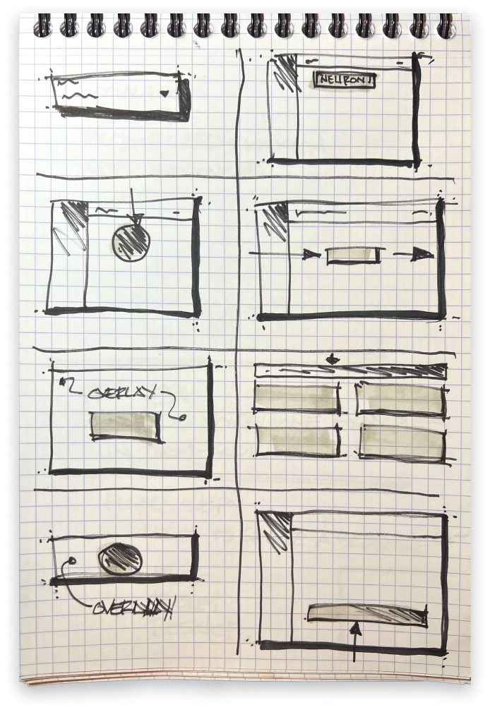
Sketches, wires, and flows
You have all week, but we're presenting it on Wednesday 🤦🏻
The Execs wanted a fresh and modern look. One that mimics the majority of luxury vehicle websites...clean and simple, and modern. We spent about 4 hours sketching and creating wireframes. Then, I remembered a skunkworks project from a few months prior. A fellow team member and I created a backplane to pin any type of content to the "home page". The user can access this "backplane" by clicking a trigger that drops the current screen to the bottom of the page, revealing a sort of "Home Page". Sadly, this project never materialized.

Concept to Prototype...in 3 Days
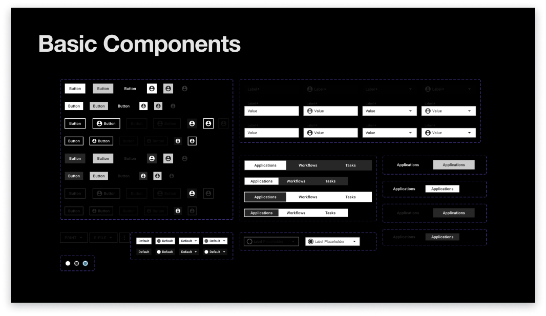
Using the designs we created for the skunkworks project, my colleague and I presented the idea to our teammates. It was accepted immediately. Since we already had the problem defined and a great start on the solution, the next step was to sketch, build mockups, design flows, and construct a "foundation" file that would contain type styles, shapes, effects, and colors.
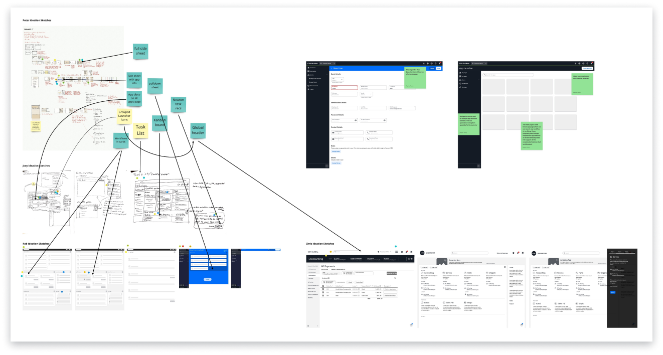

Down and Dirty, But a Sparkling Presentation
Three days later, we had a working prototype, complete user flows, and a brand new design system that would, ultimately, be used to create the updated look and feel. The Executives were so impressed with the work we produced, it was decided to showcase this new “platform” at the annual NADA 2022 (National Automobile Dealers Association) show in Las Vegas, later that year.
a modern design system
Catalyst 1.0
The feedback we received from management was very positive. We were well on our way to a new design system, a fresh, modern look, and an exciting, innovative platform that would drive the company forward into the next year and beyond. We still had a lot of work to do to get this ready for NADA 2022.

unorthodox, but very useful
A Design Workshop
Since management wanted this "new look" to feel like the luxury vehicle websites, I set out to build the design system around the idea of a sleek and simple, "Bauhaus" look. I quickly searched for Dieter Rams', "Ten principles for good design". This immediately brought back memories of my college years in Industrial Design (UIUC:BA FAA 1990). Dieter's 10th principle rings true across all types of design, "Good design is as little design as possible...Back to purity, back to simplicity." This principle would drive the design of the entire design system and lead to it's name, which I keenly called, "Catalyst". A play on words in the auto industry, but backed by the very definition: an agent that provokes or speeds significant change or action.

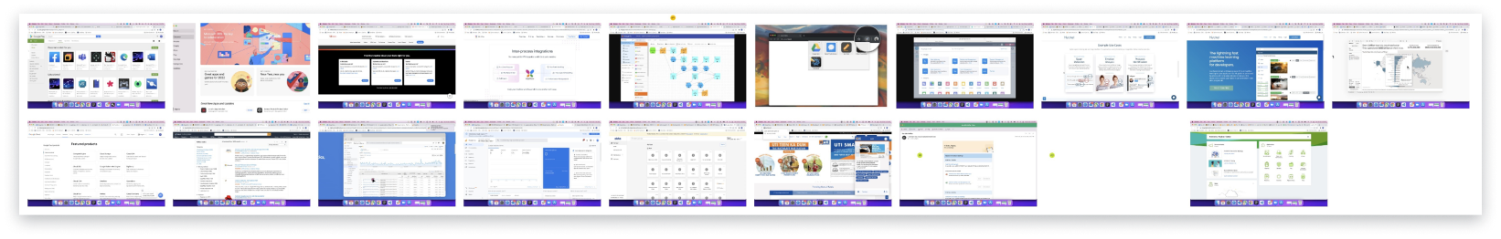
We conducted a competitive analysis of current design systems and created a legacy apps comparison with CDK's current design system. We did another competitive analysis of luxury automakers sites. I then introduced Dieter Rams' "10 Principles of Good Design" to the participants. All of this prep work was done to get the participants to start thinking along the lines of the "Bauhaus" and how simplicity reveals the true strength of design.

We conducted a brainstorming exercise that produced written ideas instead of sketches, with a twist. We reviewed some top Design Systems, created an Effort Impact Scale, and conducted a SWOT Analysis of our very own, Radial and Roadster Design Systems. Finally, we did some basic sketching exercises.
We organized workshops to expand the perspective of our team of designers and stakeholders. The goal was to encourage shared ownership of the Radial Design System (RDS) and CDK's UX vision. The RDS team strived to infuse the design system with a modern, consumer-centric aesthetic. This approach would not only shape the design system itself but also influence the experiences created by designers. The primary objective was to deliver an intuitive and comprehensive experience for both enterprise and individual users.
- Brainwriting was a great way to recruit a lot of different perspectives at once. This method helped the participants think of multiple ways to solve a problem and then expand upon them.
- The Effort Impact Scale gave us a simple way to assess and analyze what is most impactful to the user and business, in a collaborative, disciplined way.
- The SWO(T) Analysis was a great exercise to carry out while getting a feel for how the designer perceived the product, recognized its strengths and weaknesses, and found opportunities for growth.
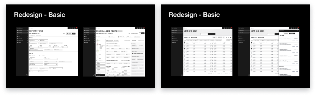
The Redesign - Basic
The "Basic" theme was based on the CDK rebrand and acquisitions. It was stripped down to an MVP that reflects current luxury auto brands and their consumer-facing presence.
The Redesign - Modern
I created a more modern style by adding full radiused corners and a primary color to elements to suggest a clear level of hierarchy. All of this went completely against Dieter Rams' effort to "discard trends and style", but this is what management wanted to see.
A Design System, Flows, and a Demo
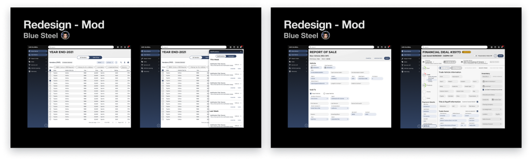
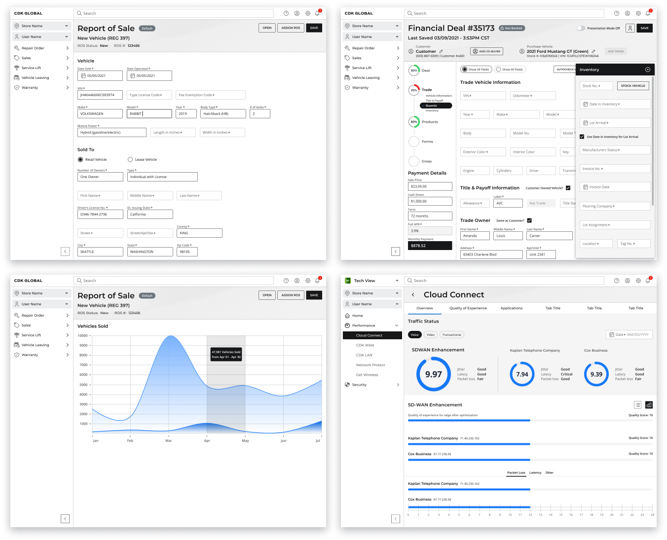
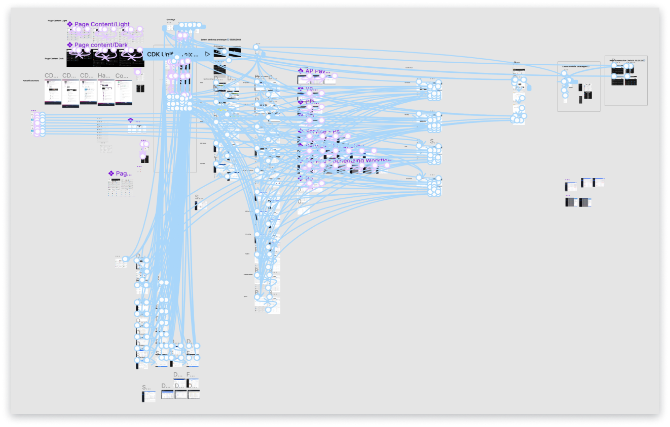
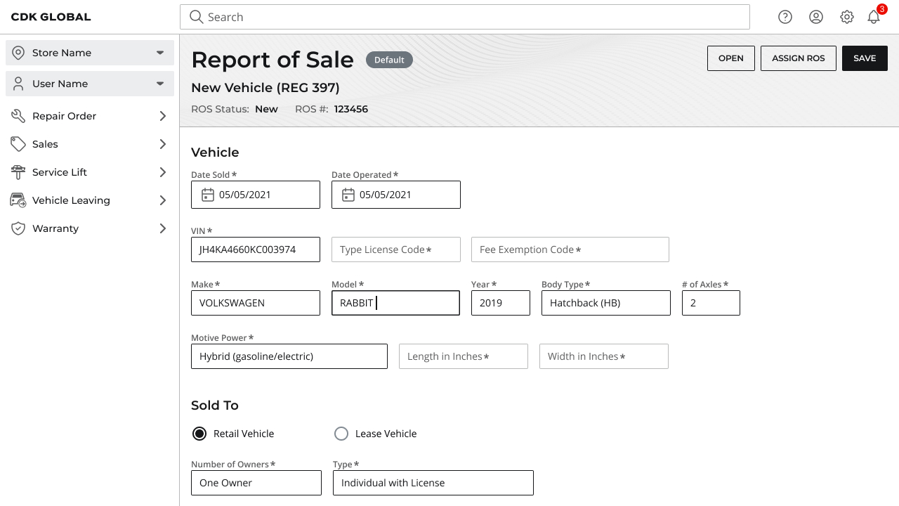
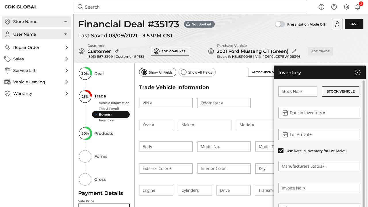
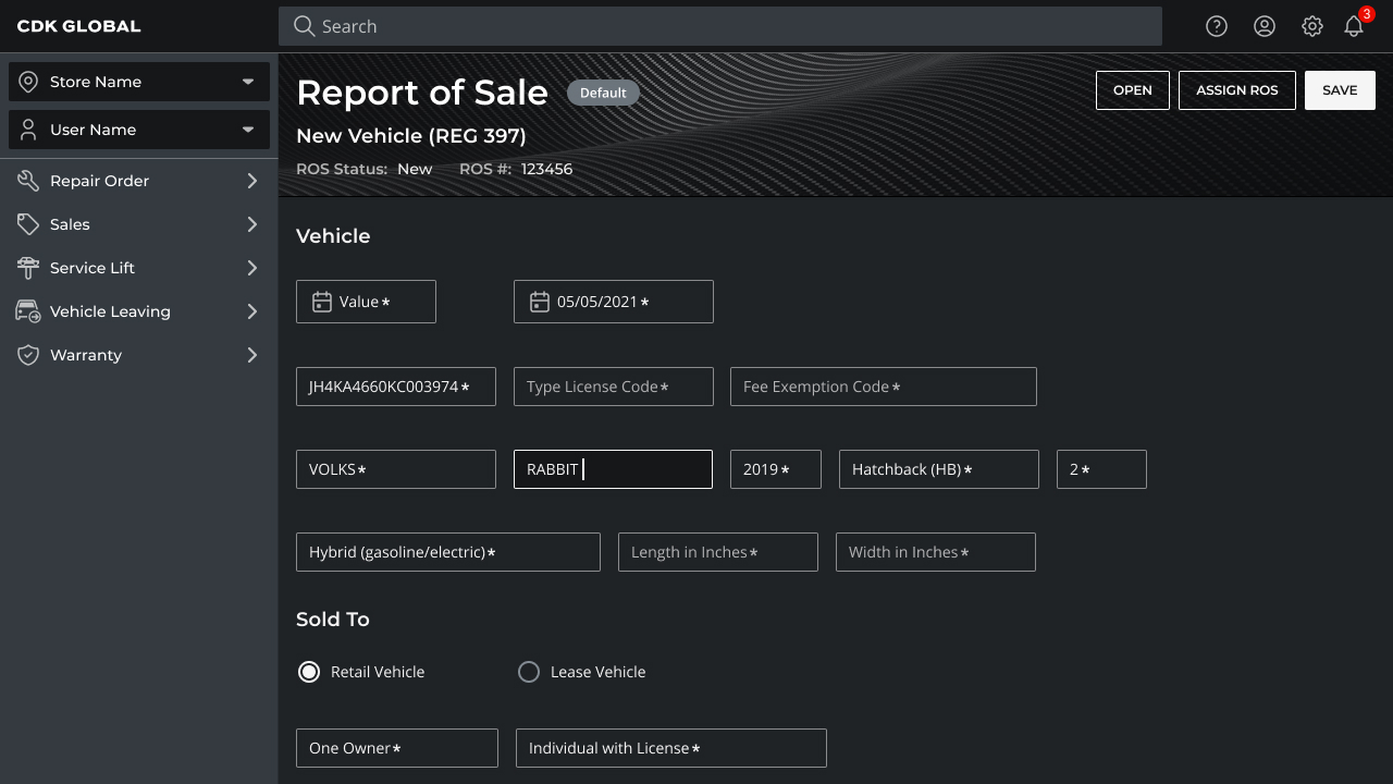
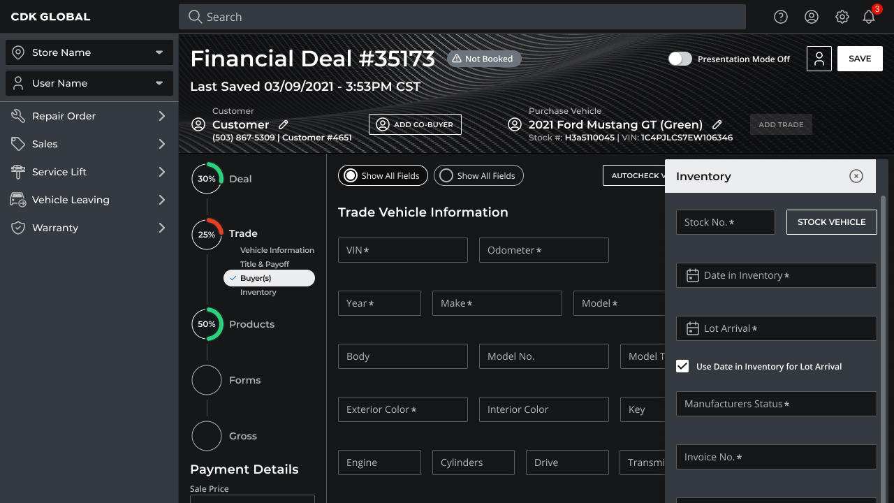
Ultimately, management selected the "Basic" style I created. So, I went ahead and completed the Foundation and Component Libraries, then published the Figma files to the team. I created a few iterations of page layout using the new design system. I built a basic form with a sidesheet, a sample data-visualization screen, and a more invloved screen, using tabs, chips, and more data-viz. These screens would be used in the presentation to all stakeholders. I then built some sample flows to walk-through during the presentation, in light and dark modes. Finally, we built a prototype showcasing the platform in action. We changed the name of the platform to "Unify" and readied the presentation deck and prototype for NADA 2022.
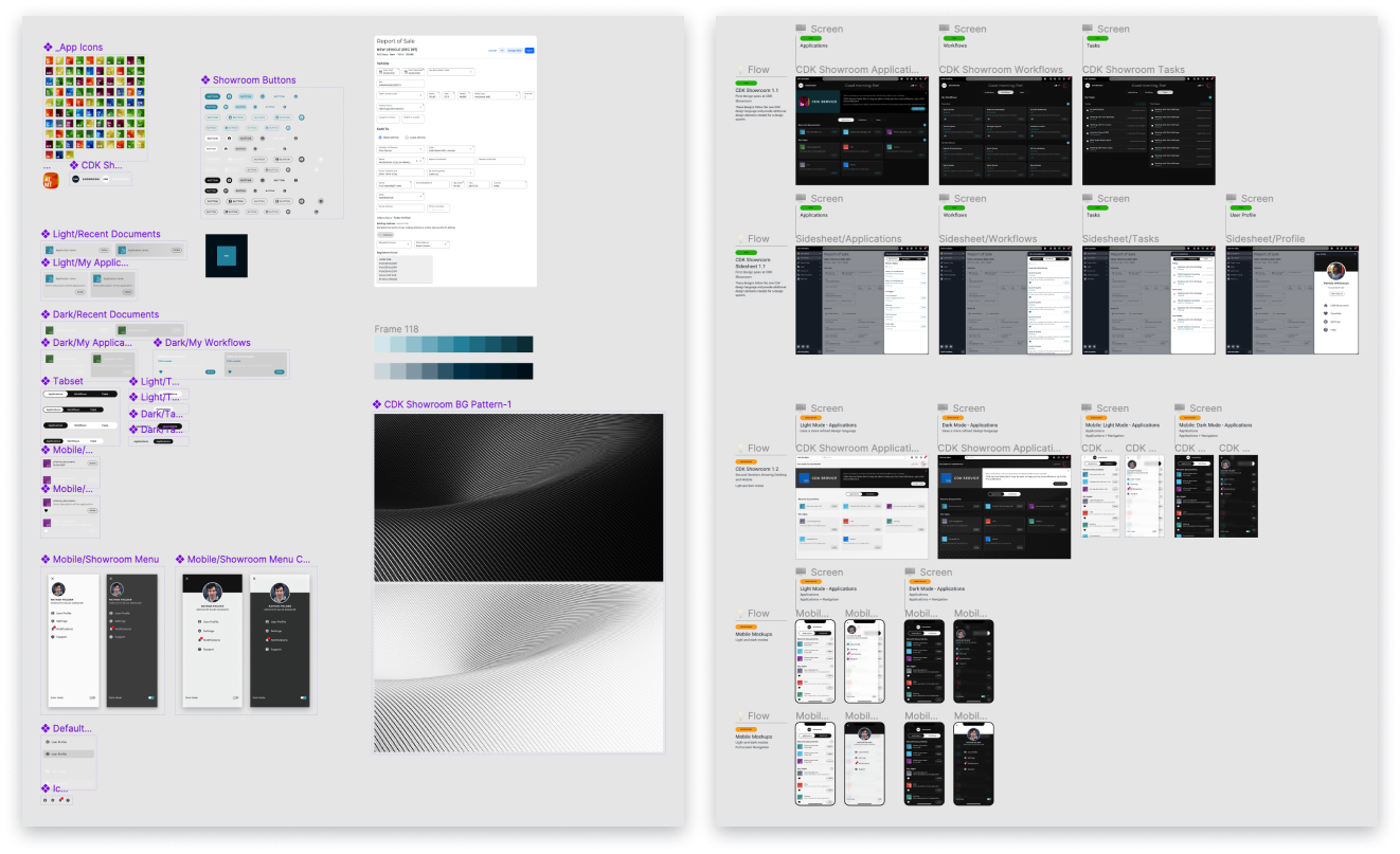
Right: Catalyst flows - Light/Dark Modes
The Results
After an entire Sprint at 100mph, we presented our new design system and concept to the stakeholders. The presentation went better than expected, as we again, had only 10 days to complete it. The team was asked to make some changes and shine it up to present in the CDK Keynote at the NADA Show 2022 in Las Vegas, on March 11-13. Our CTO would be making the keynote in front of major industry leaders from across the country.
The entire team did an amazing job in such short time, but we had no time for high-fives. Back to work!
Catalyst - Light Mode
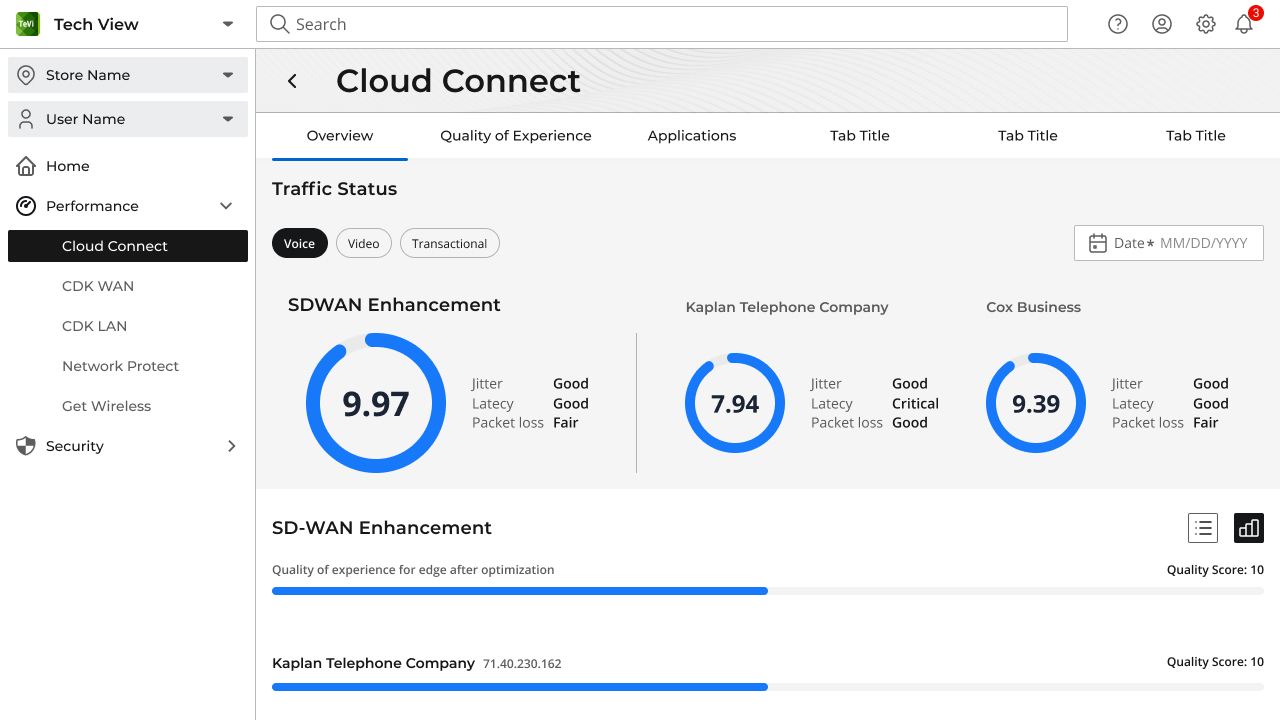
Light Mode consisted of a primary "Dark" color and greys. Application icons retained their brand colors, as well as data visualization. Primary buttons were reversed out to light text on a dark background. Secondary buttons simply became ghost buttons with a dark border. A very light grey background color was used to emphasize key content and surfaces of greater importance.

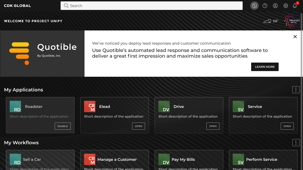
Catalyst - Dark Mode
In dark mode, the primary color is "light" and shades of the "dark" color are used in the palette. The primary buttons are reversed to have dark text on a light background, while secondary buttons are ghost buttons with a light border. A dark grey background color is used to highlight important content and surfaces.

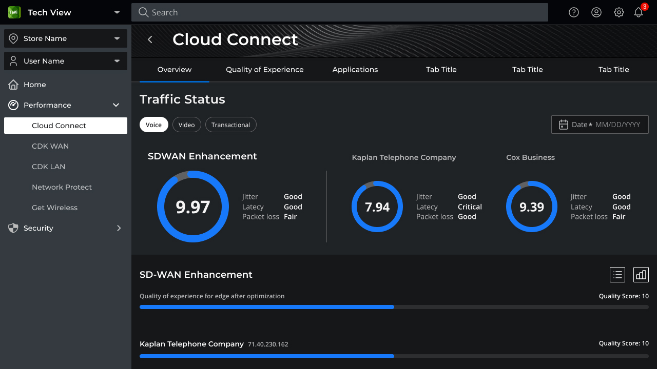
Unify Demo
The design system team was given the task of creating a "proof of concept" feature that would centralize the user's applications, workflows, and tasks. In addition, this concept should demonstrate a new, responsive, and modern UI, reminiscent of luxury vehicle websites.
As per my non-disclosure agreement, parts of the prototype that have yet to be released are not included in the sample below.
The hottest thing since Hailer!
In The News: Unify at NADA 2022
Project Unify was a resounding success at NADA 2022. It received high praise from all stakeholders involved. Dealership owners and managers were thrilled with being able to create and save custom workflows and bookmark applications, that would lead to increased productivity across the board. But perhaps most importantly, the users were delighted with the intuitive navigation, ease of use, and unobtrusive design. The successful result was attributed to the power of thoughtful user-centered design in creating a positive and pleasant user experience, which will lead to increased revenue, customer satisfaction, productivity, engagement, and loyalty.

CDK GLOBAL
https://www2.cdkglobal.com/nada2022
SALESTECHSTAR
https://salestechstar.com/productivity-enablement/cdk-global-shifts-auto-retail-software-paradigm-unveils-cdk-unify-at-nada-show-2022/
BUSINESSWIRE
https://www.businesswire.com/news/home/20220310005013/en/CDK-Global-Shifts-Auto-Retail-Software-Paradigm-Unveils-CDK-Unify-at-NADA-Show-2022
YAHOO
https://www.yahoo.com/now/cdk-global-shifts-auto-retail-130000539.html
Used Car News
https://usedcarnews.com/index.php/component/k2/item/3219-firm-unveils-cdk-unify-at-nada